interviews


Interview with Lori Sellers, Rockart, USA
transcript of a telephone interview by Lori Sellers
first published in Rockart USA June 2004
transcribed by the Rockart staff and annotated by Vengeance Incorporated editor
Lori Sellers: The main reason I wanted to interview was to get some thoughts behind the very strong and some might say disturbing image on the new album, Love Kills.
Guy, Vengeance Inc.: Well, I would hope thought provoking, not–
LS: [laughs] Ok, well disturbing to some but it must have been somewhat calculated.
GP: Well of course, any album cover is calculated, you don’t just grab some generic art and throw it up there, usually, not if you care, and we’ve always cared a lot about what’s on the album visually and how it reflects what’s on the album musically. I think it sets the mood, it always has for me, it can set your frame of mind for how you listen to the album, if you consider the music dark or light for instance, it’s like a frame of reference to begin with when you put the album on, before it starts, what to expect, a little bit, anyway.
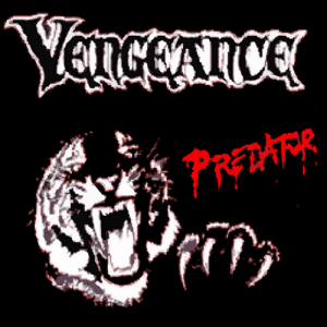
LS: Ok to get back, I started to say, I mostly wanted to ask you about the new album but as long as we’re here let’s go back, the first album was Predator, what were the motivations behind that cover, why the tiger?
GP: I think its a pretty simple cover and a simple message. The album is Predator, the cover is a roaring tiger with his claw raised, as if to attack. All our albums were concept albums, almost every song on a particular album fit in with a theme that came together in the writing of the songs, mostly in the writing of the lyrics.
LS: Which you wrote…
GP: I wrote all the lyrics for Vengeance songs, yes.
LS: So you must have had a great deal to do with that those concepts were.
GP: I think, almost without exception, I wrote the titles to the songs, and yeah, those dictate the concept and the feel of the album. Going back to the first one, we were doing our version of Judas Priest and Iron Maiden and the Predator, attack, death, all these are well-worn, hand-tooled heavy metal tropes. Overkill, Full Frontal Assault, Predator, you can see where I, we, were going.
LS: So how did that cover come about then?
GP: In those days you didn’t get on the computer and whip something up, it had to be drawn or photographed, and we had a friend who was reputed to be an artist. I don’t remember who came up with the idea it should be a tiger, maybe it was the artist. So he took forever doing it and we were ready to release the album and we went over to his house, saying look, can you do it or not we need to move on this.
So he showed us this drawing and we liked it, we wanted a few changes, maybe the claw was not there to begin with, it kind of balanced it out. But the interesting thing was, we went back to see the final version and we were impressed, it was a pencil line drawing of the tiger and it was just magnificent, very detailed, some was lost in the rendering for stark black and white you see now, but we were amazed at his work, how good it was.
Then he leaves the room and Chuck, our drummer who was more his friend than I was, was looking around the guy’s art room, and there’s this book of jungle cats, and figuring that’s what he might have used for reference Chuck starts looking through it, and lo and behold, there is the photo, with a piece of tracing paper still between the pages, with the tiger head traced on it.
So the guy didn’t draw the head at all, he traced it. We didn’t say anything, we just took the final product, thanked him and left. I do think he drew the clam himself though, although he might have traced that too, from another photo.
LS: Wow…
GP: Exactly.
LS: So did you pay him anyway?
GP: I think we traded it for studio time. I was recently going through the tapes and there are versions of him singing and us playing on Wrathchild and Ripper. I think we played those and recorded him singing with us in trade. I think he had hopes of impressing us and joining the band.
In the beginning, we were this great band musically, but I couldn’t sing for shit. The vocals on Predator are pretty bad in places. Really bad, actually. It embarasses me to listen to them now. So all these singers were wanting to join us, but I said, I’m the singer, I became the singer because lead singers are assholes, so if I have to deal with an asshole, it’s going to be me. I do think I got better though, each album.
LS: Haha it’s funny to hear a singer say that about himself, that he sucked!
GP: Well I did. It would be stupid to deny it, the album is out there, listen for yourself.
LS: I did, I didn’t think it was bad at all, I’ll listen again…
GP: No no, please don’t, let that positive impression remain, however false and misguided it may be.
LS: Is that really why you became the singer? Because singers are assholes?
GP: Well, indirectly, yes. Our singer quit in a tantrum mid-tour, so I started singing out of necessity. Also, we’d been wanting to do heavier stuff and he refused, flat out, so I started singing about 1/4 of the songs, the ones he wouldn’t do. Then our bassist quit, so I started playing bass, always meaning to go back to guitar when we got a bass player.
But then Mike joined, and he was not about to play bass, even though we were roughly about the same level on guitar, I was a better bass player and I didn’t mind, bass was fun playing it Steve Harris style, but I didn’t get to play solos anymore, so singing lead kind of made up for it. I wasn’t about to just play bass, however, so that’s the main reason I resisted adding a singer. I wasn’t going to stand in the background and play bass. I’m too much of an egomaniac. No that’s too strong, I’m just a show-off, really.
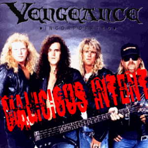
LS: Haha! Ok moving on, Malicious Intent. Ok there was a different cover on the cassette, right? So we are talking about 2 different covers here.
GP: Yeah, my then-gf drew this pencil drawing. This time we figured, let’s stay close to home. She was an artist, and I think after we started writing the songs, the first 2 songs, one very nasty towards a local guitarist we didn’t like, we all used to make fun of his over-the-top weirdness.
Then the 2nd called Whipped, about a friend and how his girlfriend called him during practice, or tried to get him not to go to practice, or actually tried to get him to quit the band or at least change the style of music, anyway we realized, this stuff was pretty malicious, I think we kicked around Hate & Malice or something like that and it’s hazy and a long time ago, but to the best of my recollection, I want to say Mark, our lead guitarist at the time, came up with the exact phrase Malicious Intent.
Or it might have been Chuck, our drummer. I remember at rehearsal the three of us brainstorming it.
So we wanted something aggressive, something sexy, so like a Frazetta viking dominitrix with a whip was the concept, and she did a good job, but it doesn’t look professional. So, for the CD I junked the old cover and used a band photo. Boring, but there it is.
Originally I had, like grafitti beards and devil horns and tits and stuff drawn on us, and the Malicious Intent like grafitti sprayed on our photo, but the other guys didn’t like having their pictures drawn on so I abandoned that and its just a photo, rendered like a painting, with Malicious Intent stamped across it. Not much there.
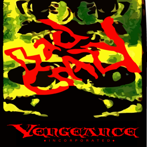
LS: Ok, Bad Crazy. Now here’s where it gets interesting to me. What is this, what is the thought? It looks like a photo rendering to me.
GP: It is, we had done a photo shoot, and some were done with a fish eye. A couple of the guys don’t like anything that distorts ro makes them look goofy, but I thought it was great. The entire album was about bad craziness, insanity, twisted reality, and it was like looking into someone’s twisted soul.
But it looked comical, just fish-eyed. So the photographer, Teresa, came up with the idea to do it green. Then she over-saturated it, and used a negative print, stretched it, mirrored it and rendered it even more, and John O’neil, who did the graphics, did the lettering, and there we had a nice image that matched the concept. And it was very striking and original and looked good on merchandise and etc. and yes, that’s a consideration.
You want an image that is going to be attractive and cool and that people are going to want to see and wear.
[see the various versions: Bad Crazy photo shoot images — Ed.]
LS: Ok, good segue, which brings us to the newest album…GP: Love Kills.
LS: Yes, Love Kills, ok this image is, as you say, thought provoking, but its full of symbolism and very stark and I still say disturbing sexual, religious, violent images. What was the thought behind this one?
GP: On this one, the band had pretty much broken up completely by the time we released it. We stopped working on it and stopped writing and recording, we became a cover band, there was literally no work for an all original heavy metal band, not unless we wanted to play with the teenagers for free down at the teen center for free, so we started playing Motley Crue and Queensryche and Aerosmith and GnR etc. and stopped recording.
Then, the label said hey guys, I need another product, the last one sold great, I can sell a buttload of CDs and tapes if you guys put out another one, but I need it quick, not a year from now, which is usually how long it took us to polish an album worth of new stuff.
So we had 6 songs in the can that the band had recorded before we quit doing originals and writing. Mike and Chuck and I did a few more, then I stuck on some of mine I had recorded myself for a personal project. These were a bunch of very different songs, but since I had written all the lyrics, they did have a common theme.
I was going through the break-up of my life at the time, really mental, and of course it influenced the songs. Every single song is about either the break-up and what a bitch she was or about romance and the feelings I still had for her and my blame in the failure of the relationship. So there was a lot to work with.
LS: Were the other guys on board for this?
GP: They never really had a lot to say about stuff like that. I’m very hands-on with all our projects and I always took a dominant role in getting the cover made.
Partially, they didn’t really care all that much, and I did care very much, so usually I got what I wanted. Everyone had suggestions I think, but usually I’d be the one who actually did the gruntwork and got it done. And it always took fucking forever with these artists and photographers, for Bad Crazy I had to take it to this place and have a 3 color separation done after the photographer and computer graphics guy had been working on it for months, then to the printer, it was all just such a fucking hassle.
I was learning photoshop about the time Love Kills was ready for cover art, so I whipped something up, and it was lame. So I replaced it later with a much more rendered and thought out cover, and this is it.
LS: Let’s talk about the symbolism on this cover. Ok, there is Jesus on a crucifix superimposed over a valentine box of candy, it looks like, with a crown of thorns on it and teeth going around the center encasing some big-nippled breasts, and the whole thing is dripping blood. And there is a little sign over Jesus’ head saying “STAY”. Oh, and a little flame at the top of the heart.
GP: That pretty much wraps it up.
LS: Well some of the symbolism is obvious, at least to me, the valentine candy box represents a heart, but at the time romance, candy, valentine. What’s the religious significance?
GP: I don’t think there is one, other than maybe Regan used a crucifix for a dildo in The Exorcist?
LS: Really? Is that what that’s about? I didn’t even think of that!
GP: Ha, no I’m kidding, I think the crucifix thing is how, when someone slights the other in a relationship, one or the other kind of hangs on this cross, like they are a martyr or very put-upon for putting up with all the shit, or they wear the perceived sins against them like a crown of thorns, which is what that’s all about.
And being in love and having a relationship is painful, no matter how great it is, there are times when you fuck with each other, and there’s torture and hurt and heartache. That’s the crucifix and the crown of thorns. And the fact that one side or the other grandstands their wounds, like ‘Look what you did to me, look how you hurt me and did me wrong’, like using it as a weapon against the other, the fact that they were sinned against more than sinned themselves.
LS: And the teeth, this makes me think of the vagina dentata, am I right?
GP: Yeah, I had to get that in there, now women trap you with that soft thing! Actually, that is true, that was there, but it was also a graphic device to give more layers and texture to the image, the box itself looked boring and trite and the other pages needed something else, another layer of interest. The outer edge of the box itself looked like teeth to me, so it as a natural progression, and yes, I was thinking of the Vag-Den when I did it, but in a humorous way. Or maybe how love eats you up? Chews you up and spits you out when they are done with you?
LS: And the breasts?
GP: Honestly, I wanted to get sex in there, and the tits fit in the heart so well. I would have put a heart shaped ass, but it just didn’t come across, and there’s the whole Oedipal thing about tits and motherhood and love, so that worked. The bosom of your lover, you know. Plus, you can’t go wrong with tits on the cover. The girl with the whip sold a lot more tapes than our photo did, on Malicious Intent.
LS: Are you serious? I guess that figures, the audience is young guys, so, there you go; and the blood is the relationship bleeding…
GP: Yeah, of course, but you know, I hate to break character and get out of the whole “artiste” thing, but it just seemed like an interesting graphic idea, it made the image more interesting and added more detail. You just don’t want a box of candy with a crucifix on it. So I had to come up with mroe ideas, more stuff. Something to make it more 3-D. And the red matches the motif, the heart-shaped box, the nipples, the blood, the teeth with pink gums, etc. it all just sort of fits.
LS: What is the significance of “STAY”, I know its a song on the album.
GP: It’s almost like a pun, at least 3 different meanings that I can think of, like you stay hanging on your cross because you can’t bear to leave your lover, even though it can be torture. Or, it can be, here, I’ve nailed you to this cross, now you stay here and like it.
It was suggested to me I needed a word, or words up there, and it would be boring to put love, like love is a cross, ugh, what is that, how obvious, so I was looking at song lyrics and names and STAY is short and to the point and it fit. In the song, its about asking someone to stay, “Stay, stay if you will,” asking them to stay with you, stay in your bed, stay in the relationship, stay in your life. But maybe its like the dead parrot, its only staying up there because it’s been nailed there, not because its alive. I think love can be like that.
LS: All right, all that is very valid, I like it, but here’s something I’ve noticed and I want to get your reaction to this. The way the words are arranged around the outside of the cover, the name of the band and the title, what does that suggest to you?
GP: I don’t know what you mean. It seemed boring and predictable to just put Vengeance Incorporated across the top or the bottom and Love Kills across the other, it looked unbalanced for one thing, because one is so long and the other so short. So I did it, I think I had a playing card in mind, or a tarot card, like you could flip it over, but like the Ace of Hearts, the center might be upside down but the corners were interchangable, something like that.
LS: Ok I can see that, but do you see where it suggests a swastika? I don’t mean that you are a latent Neo-Nazi, but like maybe it suggests the fascism of love, the authoritarianiasm where you try to control someone else, sort or like a Gestapo you check up on them and spy on them, and love can be like a concentration camp you can’t escape from, plus the psycho-sexual aspects of Nazism, all that, was that in your mind at all?
GP: Damn, you are the first one to figure that out. That’s exactly what I meant, I thought I had hidden it subtley enough that it would just be sub-conscious, but you sussed me out.
LS: Ok you’re joking, you’re making fun of me…
GP: Ha, well maybe a little, I can see it now that you point it out and maybe subconsciously I thought that? Really, I don’t think so though because I moved those words around in a lot of positions trying to make it work graphically, you know, where they didn’t run into each other, but to where it was logical and made sense in the order, so you could read it, not just random placing of the words. So it would have had to have been pretty deeply ingrained for me to end up with them there like that because I wanted it to look like a swastika, but who knows.
LS: I just thought when you see the small images of the t-shirt you can really see it, like you’re wearing a swastika.
GP: Well, something like that is either going to make sales sky-rocket or I’m going to have to pull the cover if enough people notice,-
[crosstalk]
LS: no, but I mean if it’s there, if someone sees it there it’s there, right?
GP: -so now I’ll be on guard. I guess I’ll think of it now that you’ve said it, but honestly, no, that was not part of my calculation. Do you see swastikas everywhere?
LS: Actually, in a lot of architecture and graphic design, yeah and in ad campaigns, they use patterns like that-
[crosstalk:]
GP: like recursive patterns?
LS: -four corners, and it suggests a swastika, with all that entails and is associated with, yeah, recur- exactly, right.
GP: Hmm hmm, ok, [laughs] but can’t you say the same with playing cards, or money, or any number of things that use repeating and inverted stuff-
[crosstalk]
LS: like flipped over but like a mirror…
GP: – in the four corners. I mean, yeah, the words are horizontal and vertical so you have lines, but I think its a stretch to say its a swastika.
LS: Well I’m not saying it is a swastika, I’m just saying the suggestion is there, the image is there.
GP: Well, like the music, people can make of it what they want. But we’ve never had a militaristic approach, we don’t condone that, that’s not part of our thought process –
[crosstalk]
LS: subconciously though, the truth sometimes…
GP: -although there is a song, Neo-Nazies, on Malicious Intent, which did not have a swastika that I can see, but it did have a Hitler speech, but I think the song was anti-Nazi, not really advocating…
[crosstalk]
LS: A-ha! [laughs]
GP: Now I’m in it again.
LS: No, just kidding, I’ll take your word for it, I’m just sharing what others might see, how people might read images…
GP: Well people are going to see what they want to see. I think you bring all your own prejudices and life experiences and psychology to the table anytime you analyse something, so it probably says more about the person looking at an image than the artist, almost always. Almost like a Rorshach test.
By the way, that was something I wanted to say about the Bad Crazy cover, the mirrored images, psychotic thoughts, etc. a Rorshach image was kind of intentional there with the mirrored image. But anyway, on Love Kills…
LS: Oh, and what about the little flame on top? The eternal flame of love wins out in the end?
GP: Honestly, I just felt it needed something to top it off, for symmetry maybe, or balance. I was probably thinking of the Sacred Heart, and you already have Jesus there, so yeah, the eternal flame, whether of love or just the belief that there can always be love, even if the one you have right now is burnt out, Love still exists and can exist for you again.
LS: Sacred Heart, like the Dio album?
GP: I actually think this came out first, but that would never be my inspiration, I was raised a Catholic and actually went to Sacred Heart School first to sixth grade so the Catholic imagery and terms are kind of ingrained. But I don’t want to focus so much on the religious aspect, I’m not really a religious person, it doesn’t figure into my daily life that much, I think it’s more a subconscious thing.
LS: So the flame of love is more like, what, heat of passion, something…
GP: It could be like when you still love someone unrequitedly and you carry that torch for them, maybe you carry a torch for love in general. No matter how many times it smacks you down, you carry that torch for love and believe in it, and believe that it will work for you when you meet the right person.
LS: Yes, I was thinking it kind of sets it off, also, its a different color than used elsewhere in the image, like an accent color, so its almost a focal point. Your eye is drawn to it, so maybe its the most important thing in the image?
GP: Yeah, well, besides all the symbolism, what I was honestly trying to do is make an interesting image that would make people want to buy the album, buy the t-shirt, an image they would want to be associated with. I wasn’t so much looking at the technical aspects or the symbolic aspects particularly, I just made the image and kept adding more stuff until it seemed done. I think I crammed as many layers and symbols as you can and not look too busy or contrived. At least I hope its not.
LS: I don’t think so, it seems like a complete work and very self-contained, there are no extraneous elements that really bother me or distract from the coherence of the image.
GP: Well, good, that’s what I was going for, exactly!
LS: You are very funny and humorous and unserious about the entire process of art, about your own art, almost self-deprecating. Is it that you don’t want too seem too serious or someone might ascribe the images to you personally, or that you are giving away too much?
GP: It’s more like I don’t think I’m a great artist, but I’m a pretty good graphic designer, I like the image, I think its attractive, but I don’t want anyone to read too much into the allusions I might appear to be making. They are just images, some meant to strike you or shock you so you look at them and examine them, so you are interested in them.
I don’t want to act all high and mighty about my “art” because I don’t claim for it to be that, “art”, it’s just a CD cover, it is somewhat satirical and making fun of those with a bunch of symbols and crap. I mean, I’m not putting anyone down, it just seems silly to get too involved in all that. I don’t buy all that.
LS: Fair enough! Thank you for talking to me, its been one of my favorite interviews ever, I love your artwork and you are wonderful interviewee!
GP: Hah, thank you, I’ve never looked at the covers that way you do, they were just wrappers, but thank you, I had a good time too. Any time.